January 1, 2014
•Last updated November 5, 2023
Web-Crunch Redesign 2016
I am thrilled to announce the redesign of Web-Crunch.com. If you're reading this article you are already experiencing the brand new experience!
I published my first article on Web-Crunch in December of 2014. Since then I've had a steady publishing rate of about one article per week. Now nearly two years later the blog has grown considerably. From that growth, I noticed how "cluttered" the design began to feel so I was ready to make some changes. Since I work full time for my business Couple of Creatives the blog has had to take a back seat in terms of a redesign until now. It has been a long time coming and I'm happy the time is finally here. Below is a video overview with a more detailed write up to follow.
Out With the Old
If you're new to Web-Crunch, first off I'll say welcome! and second, below are a few screenshots of the old design for some perspective. I didn't dislike the look but it felt very hacked together in the end. I designed a lot of it on the fly inside the browser rather than inside something like Sketch or Photoshop. Typically, I do my best work designing within an application rather than the browser. This time around I did just that.
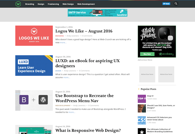
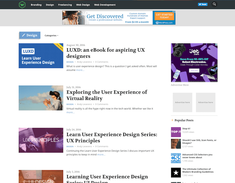
As you can see I used color as the primary signifier of different content. I carried that pattern over to the new design but in a less bold way. The pages and site architecture remain the same besides a couple of instances. Overall the update was to enhance readability as well as decrease any page load times as much as possible.
New Site Architecture
Content Management
Web-Crunch has been on WordPress from the start. I toyed with the idea of going with a static site generator but in the end, I decided WordPress still worked for what I needed in a CMS and content authoring tool. I was very close to using Kirby but decided to stay within the WP ecosystem for the sake of not having to deal with nasty migrations (even though I still had to migrate data with this redesign ). The lack of database (the best feature in my opinion) was very attractive and something I may still pursue in the future.
I never write within WordPress itself. The chance that my content may get messed up using the autosaving feature doesn't appeal much to me so I always write offline. I write using a markdown editor and then later import it into the editor within WordPress. The WYSIWYG portion of the editor is disabled.
Code
WordPress is written in PHP. The theme prior to this I made use of the same language with a few custom post types and fields. With the new design, I decided to give Timber a shot. Timber simplifies a lot of age-old WordPress PHP code you probably loathe. Your PHP files still exist (the logic) and new template files authored in Twig (HTML) format present the data. At the end of the day, I really liked using Timber and will likely continue to do so for most WordPress based websites I build.
Timber combined with Twig clean up your code tremendously. I ran into a few hiccups tying every bit of functionality into WordPress but luckily you can still use some of the original WordPress PHP functionality within your theme if you have to.
I didn't know a thing about Twig/Timber when I started the redesign so I will say it's pretty quick to learn if you are interested. Keep the docs open in a new tab on your browser and you should be all set.
Bootstrap
I started styling with CSS/Sass from scratch on the old design and essentially created my own CSS framework. During this time, I considered Bootstrap a cop-out for a modern-day developer. My opinion then was that the framework was bulky in terms of all that CSS to load and not even make use of. Luckily you can configure an optimized version for your own purposes or just load it from a CDN.
I learned that while creating your own framework allows you to try and be lean, many styles wound up missing for various elements later down the line that I didn't account for. This meant ongoing work to get things to look and function correctly. Given the lack of time I seem to always have, I couldn't always make necessary enhancements when I wanted to. It sucked.
With all that behind me, I decided to make use of Bootstrap. I did this for a variety of reasons but mostly because the framework is tested and contributed towards by many talented individuals. Their experience and skills have made Bootstrap a longstanding and highly adaptive framework no matter the device or location you view it from. I defined my own theme and some custom styles but bootstrap has my back for the remainder of the site. It just works!
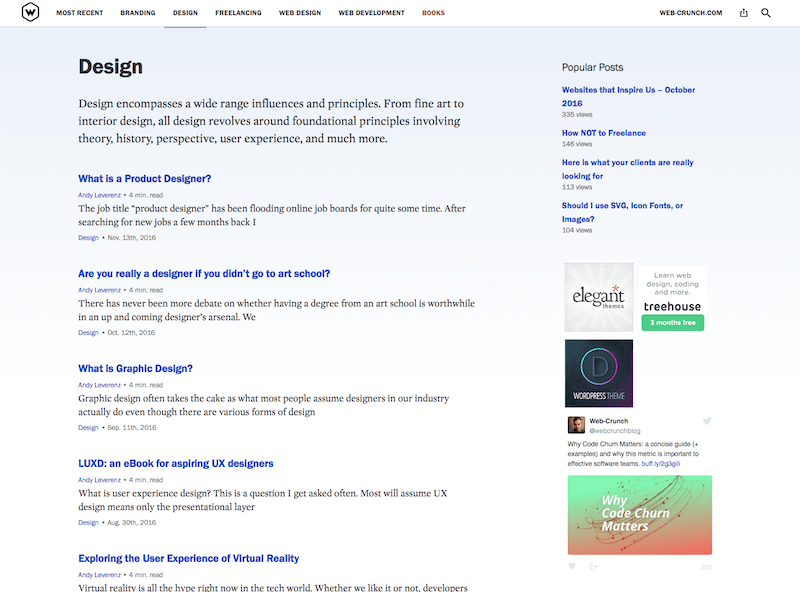
Pages
The new page structure only changed very slightly. On the old design, I admit I got trigger happy and build out a forum and job section of the site. Unfortunately, the site still needs to scale in order for those features to get real use. I plan to do this if a better opportunity arises within the next year or two.
A new Books page was added as a home for all of our current products as well as the future home of upcoming products. This page will list a brief bit about each product as well as offer a link to the product's landing page. Much of our products are free or really cheap so I invite you to check them out. The collection is small for now but more is on the way!
Design decisions explained
The new design at first glance is quite minimal. I decided this time around to focus more on the content rather than the appearance of the site itself. You can probably notice this immediately with the white background and black text used throughout.
Color

The home page is black and white minus some ad spaces and the feature post "new" label. I did this to mimic a printed publication rather than a blog. Something about imitating a newspaper column intrigued me and I think it's conveyed decently on the home page. You'll notice the lack of feature images. These now only display on the article page itself. Fewer image requests when loading the home page and category pages mean quicker page loads throughout. I'm a fan of that!

All of the hyperlinks are now a bolder blue color. This color is similar to what a browser default maybe but a bit more nice for lack of a better term. I wanted something obvious for links as the site should be quick and easy to navigate. As Steve Krug's famous title would say:
"Don't Make Me Think"
Each category archive page still retains its original color scheme used on the previous design though this time it is much less prominent. Every category page has its own dedicated color. You can preview each color by using the main navigation. Once clicked and active the category item in the menu activates a colored border on the bottom and the body of the category archive has a very subtle gradient.
Typography
Typography was the star of the show with the redesign. I used a combination of sans-serif and serif typefaces to keep the look modern but most importantly easy to read.
For the main body font I used Mercury Text from Hoefler & Co. It was recommended that this typeface is used for larger font sizes and headings as opposed to body fonts but through some trial and error, I'm happy with the results with Mercury Text as the body.
For almost all of the headings, I made use of a free @font-face font from Font Squirrel called Franklin Gothic FS which comes in four styles.
Pairing Franklin Gothic FS with Mercury Text worked nicely to my eyes. I went through a lot of different options and nearly settled on system fonts like Georgia and Arial but I decided these were a bit more for me.
Challenges and Successes
I'll summarize some challenges and successes that were made with the redesign. It's hard to tell if the design is a crowd favorite just yet but I think the concept of putting the content forward was executed well.
Challenges
- I learned very quickly If you're pressed for time use what you know to solve the problem at hand. The Timber framework is a great one as I mentioned before but I spent some time reading documentation and scouring google results looking for some answers to issues I was having. A lot of people use Timber but unfortunately, there aren't a ton of resources out there for troubleshooting. Documentation only gets you so far at times. If you decide to give it a shot feel free to contact me if you need a hand.
- Deciding to go with a very minimal design was a tough reality for me. Many people may view it as sterile and bland but that's kind of the point. I don't need massive images or funky colors to prove a point like something you would see over on medium.com. Don't get me wrong, Medium is great but I think it's getting awfully crowded...
- Images on WordPress kinda suck. Before WordPress supported responsive images I used some code combined with Scott Jehl's Picturefill library to serve optimized images to appropriate devices. By doing this I edited how each image was added to a new article. When you add an image a shortcode is then generated and automatically inserted into the content editor. This worked great until a new WordPress update came bundled with this functionality out of the box. I had to manually go through about 120 articles and remove shortcodes and add images back in. This was painful but necessary.
- I lost some data on a popular post plugin. When you install one of these be careful to use one that saves data to the database. For whatever reason, I couldn't get that data back so my most popular posts aren't quite accurate. I ended up just suffering the consequences of it and started from scratch.
Successes
The new design is way more optimized and consistent than the old one. I feel positive about the new design whereas the old one was beginning to make me cringe.
Even though it took longer than I hoped I was able to redesign the site while working full time.
I learned a new framework and kept my codebase extremely clean and clear to read.
I added a new dedicated product landing page so I have a home for future products. This also encourages me to brainstorm new ideas.
There's a video category in the works (It actually already exists and the new design already supports it but I'm working on new content now). I plan finally begin to incorporate video into Web-Crunch's content streams. Look for that very soon.
The entire experience of the redesign was a fulfilling one. I needed to learn some new things along the way so the time it took to complete was definitely longer than I had hoped. All in all, I'm pleased with the results so far. I hope the new design offers a richer experience for my readers out there. My focus was to clean things up, improve speed and performance, and make the design adaptable across any device.
I know this post was pretty long so if you made it to the end I appreciate your support! Let me know what you think of the new design in the comments.
