
June 24, 2016
•Last updated November 5, 2023
Learn User Experience Design Series: UX Principles
Continuing the Learn User Experience Design Series I discuss important UX principles to keep in mind during any experience design process. Part 6 features UX principles a designer should apply towards themselves while working towards a goal as well as principles designers should apply towards their own ux design process.
In the previous part of the series I discussed UI design, which uncovered the long time misunderstanding between UI and UX design. I also provided a long list of my favorite tools and apps to use when building out UI for my own projects. Be sure to check it out as well as the rest of the series if you haven’t so far! You can find links to all parts of the series so far at the end of this article.
UX Principles for Designers
App makers sometimes forget about their users when trying to build something. They have an idea and want to build it their way without any input from real-world users. They hire UX designers to help tie the bond between "user" and tech. The designer's job is crucial in the growth of any app out there and meeting the needs of a given user's problems is why we have millions of apps at our reach.
As a designer myself, I tend to want to be creative without limits. Having complete freedom to create whatever it is I want is what drove me towards being a designer in the first place.
Unfortunately, in my experience designing for others, I needed to think less about myself and more about the user. This limited my creativity to a degree, but I was able to be creative in other ways that help build innovative user experiences hopefully many eyes would later see.
Below is a list of principles designers can keep in mind when traversing through the user experience design process. Use these principles as guidelines to help you solve problems in a more efficient manner.
Understand the problem before attempting to solve it
From my own experience, solving problems is a lot of trial and error. Rarely do I solve a problem in a single try and if I do it’s a pretty shitty solution.
I’ve fallen victim to trying to solve a problem that doesn’t even exist. I’ll get wrapped up in how something looks or functions without considering if it's even necessary at all. Time gets wasted and stress factors begin to grow. Not fun.
If this sounds like familiar territory, I have learned that you need to first establish why a problem exists from the start. By doing this you can, not only find an answer but probably find the best answer to the problem. You can assess the facts you already know as well as gain input from others about why or how something isn’t working.
From these ”facts” you can find insight on the real problem at hand and only then begin to attempt to solve it.
Listen to your users
Most artists create art as a form of creative expression. In our modern-day world, artists need to somehow earn a living. I think UX designers are “artists” with real-world restrictions that users present before them. Our medium is anything with user invocation. We need to find ways to connect the dots in the most efficient manner.
Users have problems and need creative and innovative ways to solve them to get through their own challenges. As a UX designer, your duty is to find the path of least resistance.
Before you can find the ”best path”, you need to first understand your users. This involves collecting data on their demographics, interviewing them, surveying, and a lot more methods to really understand why or what they are trying to achieve. Read more about these methods
If you design blindly you’re shooting yourself in the foot. A design may look great, function flawlessly, but not be solving an actual problem users are facing. Take a step back and look at the bigger picture before diving in.
Empathy reigns supreme
If you can’t empathize with the problem your users won’t either. Until you uncover the pain points a user is facing how will you be able to identify their needs and wants in any viable solution? Empathy should be utilized as much as possible. It needs to be relatable to the user. For example, after a new user has registered for a web app of some sort, lead them in the right direction using cues for what to do next.
Never assume anything
Assuming you know what a user is thinking never provides great results in a user experience design. No two people are alike so you can’t design around that theory. People have similar goals but the steps in which they take to achieve them will vary tremendously.
UX Principles for Design
Like designers, “Design” has some good principles to abide by. These have been established as a best practice simply because they offer the most reward and value in given user experience. Here’s a handful of my favorites you can use in your next project.
Limit choice
While most people would be inclined to think that the more choices the better, this theory actually hurts user experience. It does so by slowing down the journey as well as making the user have to “think”.
By limiting choice, users will only be able to follow the path in which you designed. The idea is to give the user control but still limit what they can and can’t do.
The more choices, the harder it is for a user to choose. More options won’t necessarily make a product or service better. In fact, it may only make matters worse.
Keep related content/elements together
Grouping related elements together make the content in which you display clearer to the user. Even if the user has to “learn” an interaction or a behavior, that all needs to be relative to the element on their screen.
For example, say you wanted to allow the user to update a text field of some sort. The field currently has text inside it. There is a pencil icon to the right of it. To edit the field the user simply clicks the icon, edits the text, unfocuses from the text field and viola, the new entry is saved.
Having the “edit” icon next to the text makes it easier for the user to get in, change something and get out. This same concept can apply for nearly any type of content.
Limit interactions
The less a user has to interact the better when it comes to performing tasks they initialize. A user shouldn’t have to work hard to perform a single action from the front-end of any application. Limiting the number of clicks/taps offers a more rewarding experience as the “app” does the heavy lifting for the user. This is the whole point in building an application in the first place don’t you think?
Offer helpful cues or waypoints to guide the user
Sometimes an application needs a hand in aiding the user along their journey. A great way to help is to provide visual cues within an application. Be sure to prompt the user asking if they would like these “cues” before they are presented to them. I’d also chime in and say to only present these cues where necessary. Much like annoying popups you see on many websites, the cues can quickly become a nuisance if not used wisely.
Provide confirmation warnings
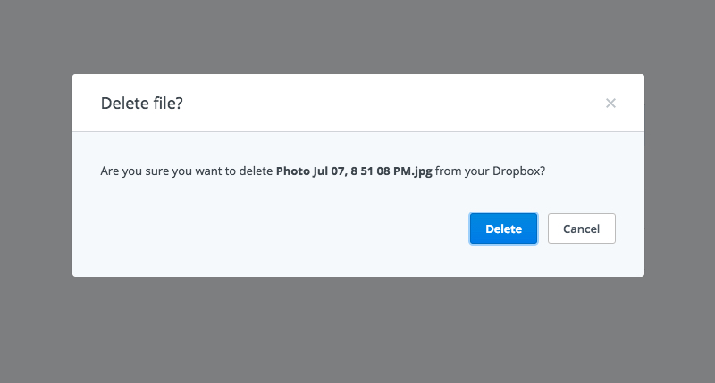
Accidents happen. Be sure to always present an escape plan. Any deletion or revision of an object should be confirmed by the user first. This is another interaction, but it often saves a user’s ass if they didn’t intend to perform the function.
When deleting a file on Dropbox, for example, you are presented with a confirmation dialog window like below:

Some applications allow you to undo actions even after the confirmation warning. This often means more technical requirements on the back end but is definitely useful for users. It's up to you to decide what to support but the conformational dialog is a highly used principle in many user experiences.
Limit noise
Often times the expression “less is more” finds its way to many user experience designs. Only presenting what is relevant is definitely a good principle to design by. Hiding UI when not in use or showing UI at an ideal time is a great way to let the user not feel bound by the application itself.
Provide defaults that make sense
Most applications start you off with a set of “defaults”. This can be anything from an avatar photo to font size and color. The intent is to give an easier place to start so less work has to be performed.
Starting off with odd “defaults” may prove to be annoying to many users. Going one step further, not allowing “default” settings to be overridden can also be extremely annoying.
Keep it consistent
Presenting actions and layouts in a consistent manner prevents users from having to hunt to find what it is they are looking for. Try to not bury action items that get the most use.
The look and feel of an application also need to remain consistent so try to avoid throwing in a randomized UI design. A great way to remain consistent is by developing a pattern library before any real user experience is designed. These elements can then get repeated where necessary in a consistent manner.
Always offer a way out
Don’t let your users fall into a black hole. They need a way out of any experience. If designed and implemented correctly, a user will never feel have to feel “lost”. At the very least, give the user the opportunity to start again.
Accessibility matters
Never assume all of your users can see, hear, and perform just like you can within a user experience. Some people have disabilities and need to have access to the same experience as anyone else normally would. Being a UX designer who focuses on accessibility means your job gets harder, but if done well, is more rewarding. I would argue that knowing absolutely anyone can access your design and understand it makes the extra effort all worthwhile.
Further Exploration
- Dieter Rams: ten principles for good design
- Facebook Design Principles
- 10 Usability Heuristics for User Interface Design
- Fundamental Principles of Great UX Design | How to Deliver Great UX Design
