

December 27, 2014
•Last updated November 5, 2023
How To Establish Your Brand and Identity: Part 2
In Part 1 of How To Establish Your Brand and Identity, I discussed the many aspects of Branding. I remind you that branding isn’t just about a logo or stationery package but rather the feeling or image the brand gives you as you digest it. I also covered the steps you take to develop your brand as well as provide some examples of popular re-brands we see every day. Be sure to read it before this part.
Part 2 will deal with Identity. I will speak of what it is, why it is important and how you can develop your own.
Identity
Identity is the visual aspects that form your brand. These aspects can include color palette, typefaces, layouts, measurements, and more. Identities exist to keep things consistent for your brand. Guidelines or Style Guides are sometimes set in place giving anyone who works with the brand a set of rules to follow when developing their work.
Each piece of identity should support the brand as a whole. There shouldn’t be a misconception as to where the identity came from or what brand it belongs to.
Where to Make Use of Identities
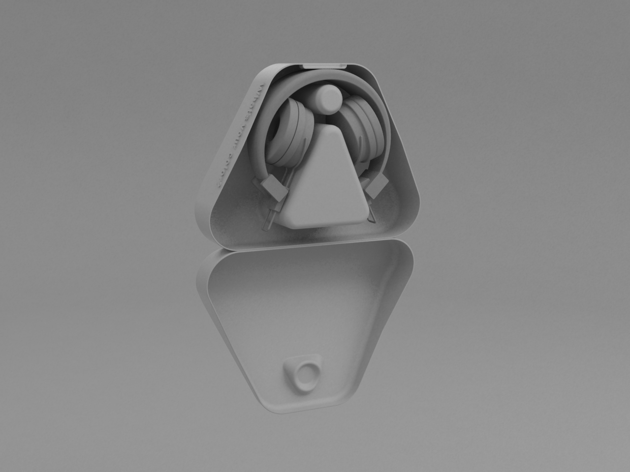
Identities can be used in just about any situation. Some are more common than others like a logo design or stationery package. Then you have oddball identities like moving billboards or environmental graphics that while are unique sometimes catch you off guard. Below are some basic examples of identities in use today:
- Logos
- Letterheads
- Business Cards
- Envelopes
- Packaging
- Apparel
- Signage
- Decals
- Advertising slots
- Web Ads
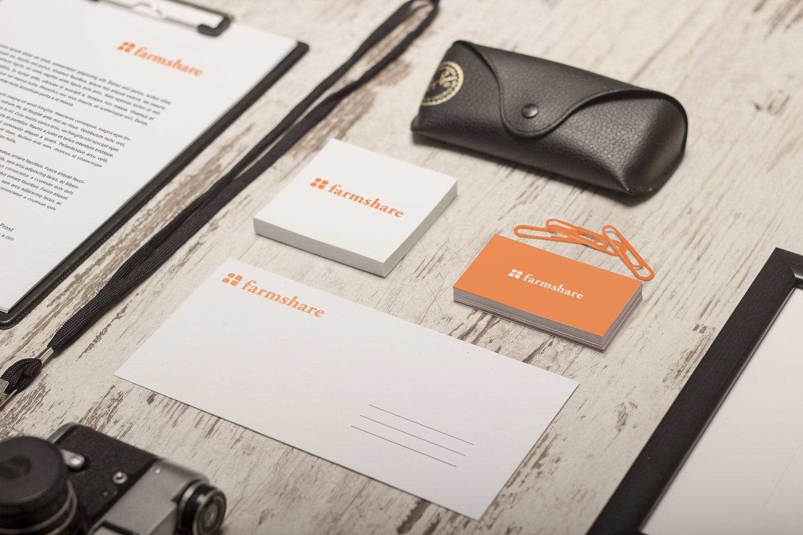
And here are some modern approaches
Thinking outside the box or in is a great way to make your brand and identity stand out. While you don’t have to reinvent the wheel, you do need to be careful with the form because most people value functions more. If a product or good doesn’t function, the form should be the least of the product maker’s worry.
Form Follows Function
In any good design, a great principle to follow is Form Follows Function. The form of design(shape, size, height, width, etc...) should always be based around its function. Applying identities to furniture, apparel, or environmentally based objects is a great example of this principle. Using this ideal, your identities transform into an extensive collection of visuals that tie your brand together.
Designed by Laura Gonzalez de Durana, Arelis Feliciano, and Susana Siegel
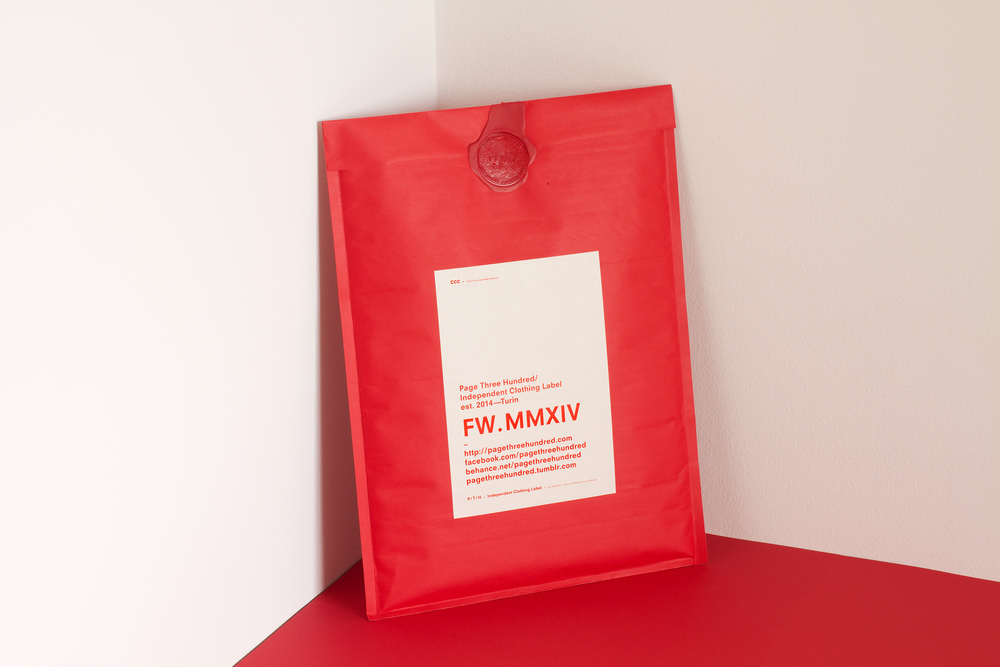
Designed by Page Three Hundred
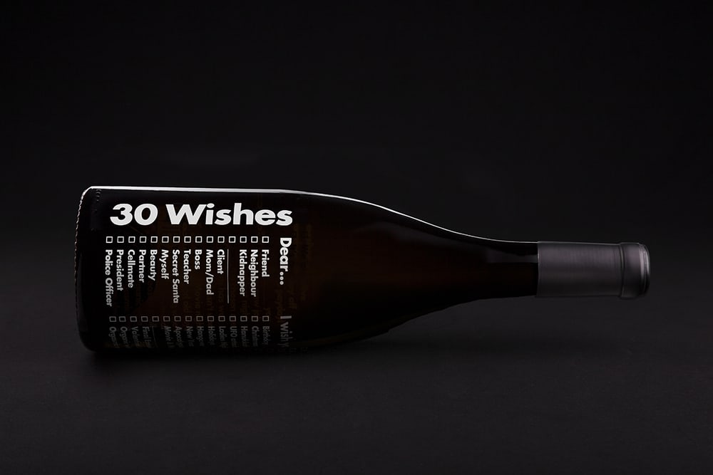
Designed by: Albert Virgili Hill & Derrick Neleman

Developing your own Identity
Developing an Identity can be a grueling process. A logo, for instance, can take several tries to get right and just when you think you have something you decide to go a different route.
My Own Experience
Back when I was in college, I was assigned a project for my identity class to create an identity for a nonprofit organization. The organization I was assigned was called Farmshare. Even though it was just an assignment my professor when out of her way to find a real organization for my classmates and myself to use. Farmshare is an organization that delivers fresh local produce to the impoverished community. This product is the kind of product that doesn’t make it to a typical grocery shelf. This doesn’t mean it is blemished in any way but just the kind that didn’t pass a typical grocer’s inspection.
After studying the company and identifying their problems, goals, and successes I had enough to start sketching ideas. This process took some time and a lot of sketches. I spent over two weeks in class every other day trying to find a typeface, logo concept, and overall brand-able image to convey. It got to the point where I was nearly about to give up until my professor chimed in and helped me brainstorm. We worked together for about a three-hour block when I finally got an idea to push forward with.
My idea was to symbolize both the “human” element and the “produce” element within the Farmshare organization. Combining these two helped me create a mark that identified a human and a corn cob. Getting this far helped layout the branding for the rest of the pieces.
The Results:
 The initial mark/concept of the logo which symbolizes a human and produce (corn in this instance)

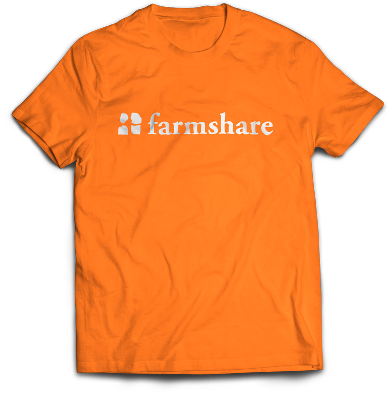
The typeface makes use of Adobe Garamond Pro Bold which is a serif font-family. I chose this for both legibility and the feeling it portrays. You could say it feels “farm-like”, especially within this application.
I chose bright orange for the main color palette. I went with a single bold and bright color to not only stand out but to help save on costs. Any type of printable media will always cost more if you use more than one color. Being a nonprofit organization, Farmshare isn’t out to make money but rather support those who can’t seem to. I tried to keep this in mind when it came down to costs for printing by using a single color.
The Experience
This project opened my eyes to what it takes to develop a timeless brand. Some brands undergo re-brand after re-brand only to find that they should have just kept their old identity. People connect with brands and identities on a psychological level. It helps them decide which goods or services best suit their needs. Branding is about feeling as well as selling. Branding and Identity can take an otherwise unknown company and transform it into something that looks and feels like it has been around for ages.
Closing Thoughts
Most designers know there’s much more to a logo or typeface than meets the eye. We know so much work went into developing that stationary package or t-shirt design. It’s our job to educate people who seek our services as to why brand and identity are crucial pieces in a company’s success. Without a public presence, a company has nothing to tell their story. People need something to identify you with. They need to understand what you have to offer, what you stand for, and how you can help them. If they understand your message then there’s nothing that can stop you.
Have you had to rebrand or create a new brand? What was your experience like?"
