

June 14, 2015
•Last updated November 5, 2023
An Exploration of Grids in Modern Design
Grids are used everywhere. These invisible forms help us keep content aligned in a certain way whether it's on paper or on screen. Many artists or designers go above and beyond to create abstract grids that essentially break a consistent flow that we all know and love. Grids are rigid and help people digest information quicker. Books, for example, have margins and specific layouts to denote easier reading. Web pages offer the same approach in displaying content in an organized fashion in an effort to allow for quicker and easier content consumption.
This post will discuss different types of grids you can use in your projects and ones that have stood the test of time. Grids of all types can be used or created to offer a new view on the way we read and discover all types of information.
What is a grid exactly?
A grid consists of a distinct set of alignment-based relationships that act as guides for distributing elements across a format.[1]
All grids contain basic parts no matter the complexity. Each part fills a specific function; the parts can be combined, or omitted from the structure at a designer’s discretion.
Using a grid depends a lot on the content being consumed. A glossary, for instance, will likely have a different grid than a newspaper. A designer must anticipate problems related to the structure of the grid before approaching design. These problems could consist of images or text being clipped off. Working around this is possible, but thinking ahead on how to go about solving these problems this is crucial to establishing a good design.
Do I always have to stick to the grid?
The short answer is no. The longer answer is that sticking to a grid you establish from the beginning is certainly wise but a grid is essentially a precise guide to follow to provide unity from page to page depending on your project. Containing images or text inside of the grid if possible is an ideal solution but if absolutely necessary you can break the grid to create a more compelling design.
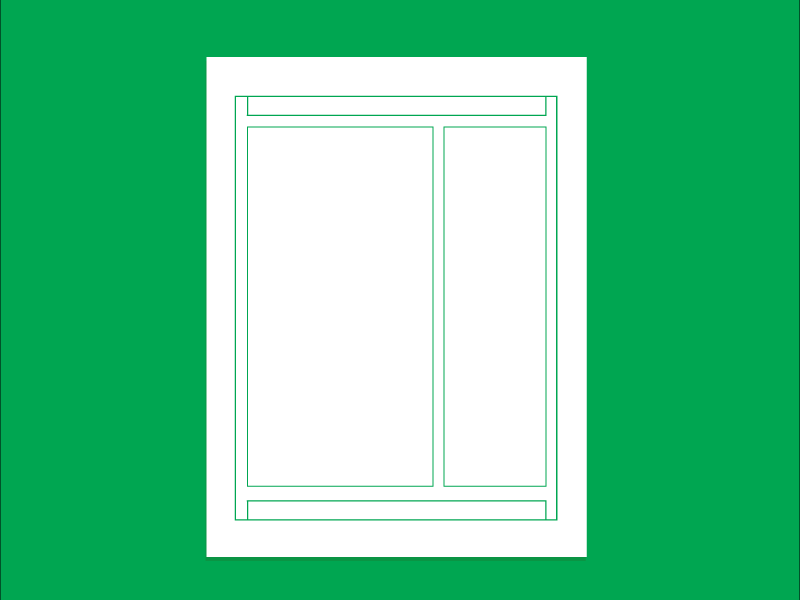
Anatomy of the grid
There are different parts of grids to use your projects. These elements are useful to understand to know how to properly layout the information you need to design around.
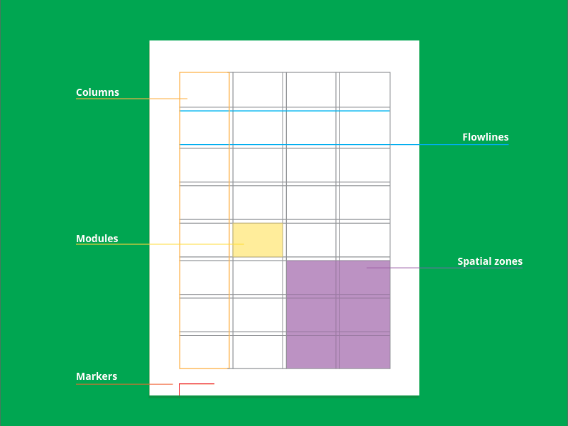
A diagram of the parts of any basic grid
Margins - are the negative spaces between the canvas you are working with. This space surrounds the live area in which content is inserted. Margins are a key role in tension within a composition. The wider the margins the more focused content is portrayed. Have you ever noticed that books have wider margins? This is on purpose so it makes text and imagery easy to digest.
Columns - are vertical alignments. These divide the page vertically to allow you to break up text or images into sections of the page. Columns fit between the margins. Sometimes they are of equal widths and sometimes they are different widths depending on the specific information.
Flowlines - are alignments that break the space into horizontal bands. Floweriness help guides the eye across the canvas and can be used as starting and stopping points for text or images.
Modules - are units of space-separated by flowlines and columns. These are naturally formed and fill the space of the canvas between all margins.
Spatial Zones - are groups of modules that together from distinct fields. Each zone can be assigned a specific role for displaying different types of content be it images or text.
Markers - are placement indicators for repeated elements. Tiles, images, and more occupy this space on each page of the project.
Different types of grids
There are a few different types of grids used in almost all aspects of design. These grids can be simple or advanced depending on how they are used and modified. Modifying a grid means there are virtually endless possibilities when it comes to layout and organization in your design.
Manuscript Grid
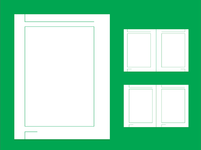
A Manuscript Grid is great for books, essays, novels, and more.
Probably the most simple grid is the manuscript grid or blocks grid. The structure takes up most of the canvas in a rectangular fashion. This type of grid is commonly seen in books or printed collateral of multiple pages. It has a primary structure. The text block and the margins that define its position on a page, as well as a secondary structure that defines other essential details. There is a running header and footer as well as a specific spot for page numbers or footnotes if appropriate.
With such a large area for text, a designer must care to use it wisely and retain a highly legible structure. When using spreads it's important to retain balance or asymmetry when viewing a page next to another. The size of type, as well as the leading all, plays an important role in the design within the manuscript grid.
Column Grid
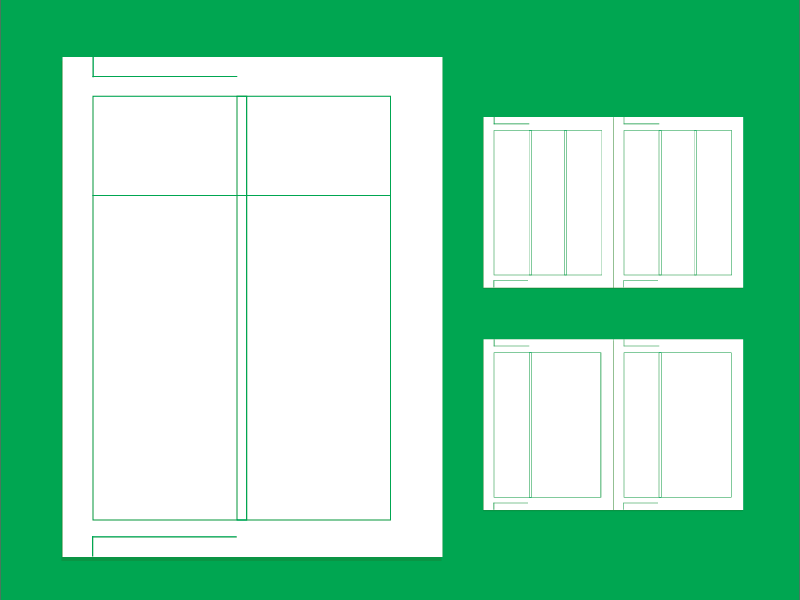
A column grid is great for newspapers, editorials, articles, and more.
A column based grid expands on a manuscript grid by introducing vertically spaced sections inside the main content area. Columns can be spread across the content area equally or divided in thirds or any other fashion that may presume to appeal to the designer. The width of the column typically depends on the running text type. If there are a lot of widows or line breaks the column size may need to increase in width and or type size increased or decreased. There are a lot of factors to consider when setting up a column layout. These grids are great for outlines, articles, newspapers and more.
Modular Grid
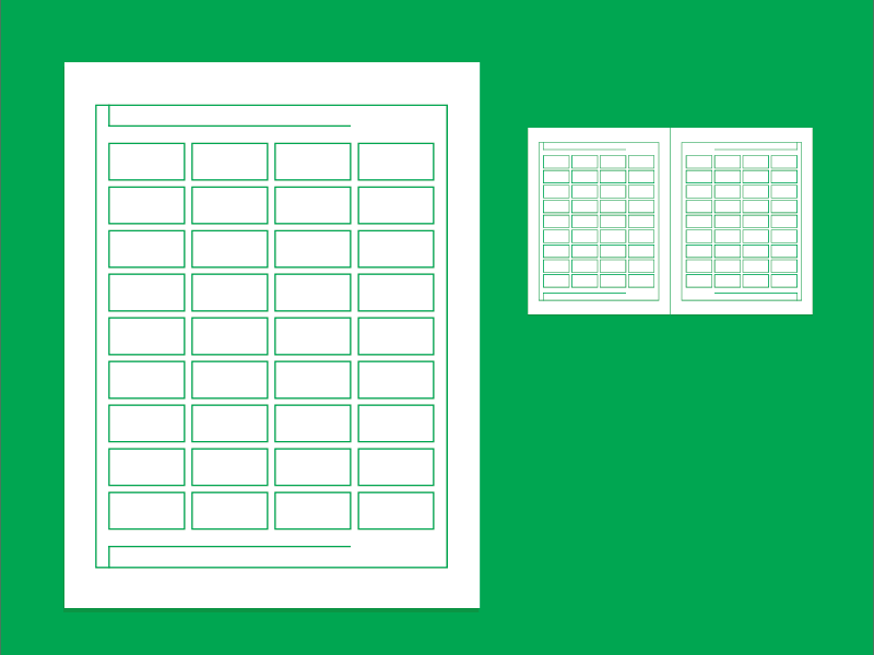
A modular grid is great for advanced layouts which can include a lot of images and text.
Modular grids are often introduced on complex projects which include a lot of images and text on a particular canvas. Newspapers or abstract article layouts use this approach to offer alternative approaches to design. I defined earlier what a module is. These are heavily repeated in this type of grid. Determining the width and height depends on a lot of factors ranging from image sizes and proportional to the length of the smallest paragraph in your project. Even projects with simple informational needs or single pages can be built using a rigid modular grid, adding the additional meaning of order, clarity, and modernism.
Hierarchical Grid
Hierarchical grids work well for web pages or pages with a lot of repeatable elements that live where they do based on the content being displayed.
Some projects require a grid that doesn’t fit into any type of category. Hierarchical grids rely heavily on the content rather than the grid itself. Information that needs to be displayed in a particular way dictates how the grid is displayed. In web design, this is a common approach as many websites you visit all utilize different types of grids to show content effectively. Every website strives to produce rich content and in doing so they will design in such a way to make it easiest to see the most relatable content to you first. A common approach in web design is to have a dedicated header and footer of a page with the main content area and a second content area ( e.g. a sidebar). This type of grid, whether it's used to build books, posters, or websites, is an organic approach to the way information and the elements you see are ordered that still holds all the parts together.
Breaking the grid
It’s almost a fact that when using a grid there will come a time where you will be forced to break it. Doing so may seem like a failure but in reality, this provides an organic visual to the user. This humanist approach may attract attention in a way that is positive.
Grids are meant to be used as guidelines. You may have heard the expression “Rules are meant to be broken”, this might not apply in everyday situations, but with grids, this is an acceptable practice. Now don’t get me wrong, you will still need to uphold the guidelines in place but once in a while, a paragraph of text, a heading, image, or any other element will prove to be better suited breaking the grid.
“Rules are meant to be broken”
A grid is truly successful only if, after all the problems have been solved, the designer rises above the uniformity implied by its structure and uses it to create dynamic parts that will sustain attention and interest for the life of the page or project.
Being too strict with a grid is a common danger many designers fall into bed with. This makes things seem repetitive and uninteresting to the reader. Variety plays a big role in the way a book, magazine, or web page is laid out. Switching things up keeps a reader informed, interested and positively affected with a sense of humanism. By creating a rhythmic flow among spreads, designers can successfully use grids to work together with their content in a way that is still distinct but still works as part of the whole.
Key takeaways
Below is a list of key takeaways about grids. Use them to your advantage and not to your disadvantage, after all, they are just a tool.
- Grids are tool designers can utilize to create more cohesive designs within any type of printable or digital project.
- Do not let grids work against you but rather work for you.
- Do not be afraid to break the grid. It is there as a guideline. You will be presented with problems. You will have to find appropriate solutions.
- A grid will not solve all of your design problems. Attention to other areas of concern such as type size, image proportion, leading, tracking and more all play a huge role in using a grid successfully.
- You do not always need a grid. There was a period called deconstruction that totally customized a grid to be so organic that it seemed unusable to most designers.
- If you use a grid. Use it consistently but don’t make every page exactly the same. Repetition leads to a lack of interest which is a failure from the start.
Do you use grids in your own projects? Have you ever studied different types of grids to use to switch your designs up? Let us know your story in the comments.
[1] - Making and Breaking the Grid - A Graphic Design Layout Workshop - Timothy Samara
