July 3, 2017
•Last updated November 5, 2023
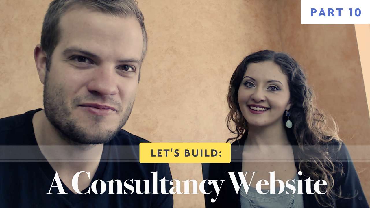
Let's Build: A Consultancy Website - Part 10
Part 10 of the series rounds out the home page design for my first comp of the consultancy website design. Watch as I finish the home page design and explain some of the behind the scenes work I did to arrive at some of my design solutions.
The Process Section
I spent another two or three hours designing the "process" section of the design. I couldn't land on a layout that seemed fresh to me so I tried and failed at many attempts to get something worthwhile. As you saw in the last part of the series ( the video in which I sped up) I finished with a basic list and boxes for the process. Since there are 6 process steps all together I needed a more elegant and less mundane solution to display them.
Enter the new bright red box featuring Alyssa herself and an offset grid of the process. I wound up at this design because I hadn't seen anything like it before. It's not quite predictable but not too far outside of the style and feel we are going for as well.
Testimonials
The testimonials section was another bear when it comes to being truly original. A typical testimonial is a quote from some happy customer about the subject or person in mention.
Displaying this in a new refreshing way is rather difficult. I fast-forwarded this process to show you the trial and error I was dealing with. In the end, I wound up with a solution that will essentially animate within a container and be a sort of carousel approach.
Each testimonial block has a small border on top with a background color of our main branding color. These will rotate slowly on their own as the user navigates through the page. The animation would be infinite in theory.
Designing the Bottom Call To Action
The simple but large call to action is a bold approach to getting the attention of the user. My goal here is to create that feeling of "invitation" to connect with Alyssa. I don't want to make the user think there should be any barrier in the way. To support this I also added her image so the user knows exactly who they will be talking to. This call to action along with many others will link through to a contact page where people can ultimately get in touch with Alyssa.
The end goal is to create a funnel effect so Alyssa can gain qualified leads through inbound marketing.
The Series So Far
Music credit: https://soundcloud.com/argofox/elexive-sheriff
Categories
Collection
Part of the Let's Build: A Consultancy Website collection
